Design comparison
Solution retrospective
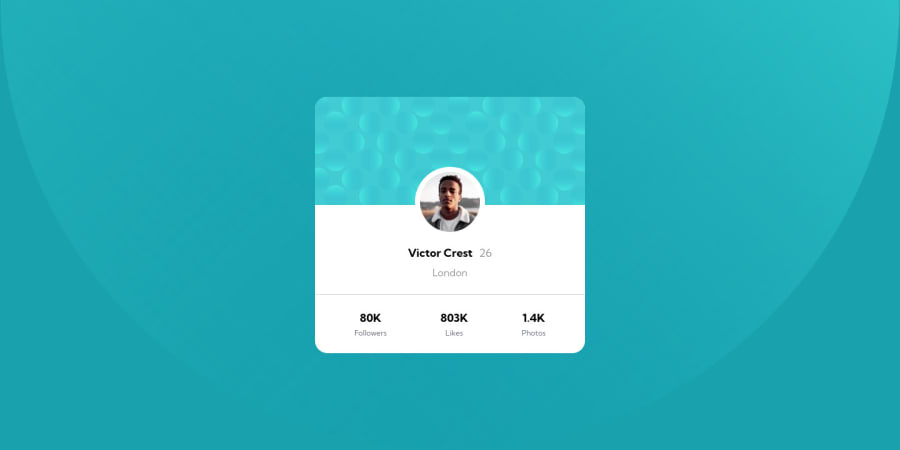
Hello everyone! I think my major problem was trying to make the background the same with the design but unfortunately I couldn't. Open to suggestions how to position my background properly.
Community feedback
- @catherineisonlinePosted almost 3 years ago
You added background-position: left bottom; however you can also make it more specific. I did like this: background-position: top -900px left -700px, bottom -1250px right -550px; Maybe not the best choice but it helped me :D
Also, you have an accessibility issue - you need to downgrade the heading by one. So after h1 have h2, then h3, and so on.
Marked as helpful3@JohnIdenyiPosted almost 3 years ago@catherineisonline thank you. I never knew about this accessibility rule. Glad I now understand.
0 - @GrischKPosted almost 3 years ago
Good job man ! That's clean and similar to the design.
0
Please log in to post a comment
Log in with GitHubJoin our Discord community
Join thousands of Frontend Mentor community members taking the challenges, sharing resources, helping each other, and chatting about all things front-end!
Join our Discord
