Design comparison
Solution retrospective
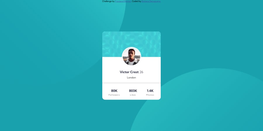
This was HARD. I had difficulties with the background. It worked in desktop and mobile view, but when you will openning the view the circles just move and I think that it needed to be centered and not just moving.
How can I change this?
Please give me your feedback, it'll help a lot. Thank! :)
Community feedback
- @0xabdulkhaliqPosted over 1 year ago
Hello there 👋. Congratulations on successfully completing the challenge! 🎉
- I have other recommendations regarding your code that I believe will be of great interest to you.
REGARDING BG iMAGE 📸:
- let me explain how you can easily apply the
background color
with thebackground svg
they provided.
- Add the following style rule to your css, and then experience the changes
body { background: url(./images/bg-pattern-top.svg), url(./images/bg-pattern-bottom.svg); background-position: right 52vw bottom 35vh, left 48vw top 52vh; background-repeat: no-repeat, no-repeat; background-color: hsl(185deg, 75%, 39%); }
- Tip, Don't forget to generate a new screenshot after editing the
css
file
HTML 🏷️:
- This solution generates accessibility error reports, "All page content should be contained by landmarks" is due to incorrect usage of
semantic
markup, which causes lacking of landmark for a webpage
- So fix it by replacing the wrapper
<div class="content">
element with the semantic element<main>
along with<div class="attribution">
into a<footer>
element in yourindex.html
file to improve accessibility and organization of your page.
- What is meant by landmark ?, They used to define major sections of your page instead of relying on generic elements like
<div>
or<span>
. They are use to provide a more precise detail of the structure of our webpage to the browser or screen readers
- For example:
- The
<main>
element should include all content directly related to the page's main idea, so there should only be one per page - The
<footer>
typically contains information about the author of the section, copyright data or links to related documents.
- The
HEADINGS ⚠️:
- This solution has also generated accessibility error report due to lack of level-one heading
<h1>
- Every site must want at least one
h1
element identifying and describing the main content of the page.
- An
h1
heading provides an important navigation point for users of assistive technologies, allowing them to easily find the main content of the page.
- So we want to add a level-one heading to improve accessibility by reading aloud the heading by screen readers, you can achieve this by adding a
sr-only
class to hide it from visual users (it will be useful for visually impaired users)
.
I hope you find this helpful 😄 Above all, the solution you submitted is great !
Happy coding!
Marked as helpful1@barbaradamasdevPosted over 1 year ago@0xAbdulKhalid Wow, already adjust the position and worked perfectly.
And I'll study everything that you mentioned. Thank you so much!!
0
Please log in to post a comment
Log in with GitHubJoin our Discord community
Join thousands of Frontend Mentor community members taking the challenges, sharing resources, helping each other, and chatting about all things front-end!
Join our Discord