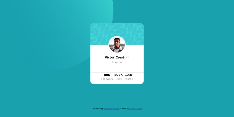
Design comparison
Solution retrospective
Hello, this is my first challenge. I have the elements placed in the right position for the desktop requirement, but I'm having issues with the mobile media-query. Will be refactoring in the meantime.
Any feedback is very much appreciated, Thank You.
Community feedback
- @MiltonChungPosted almost 4 years ago
Hi Keven! First of all, nice use of semantic HTML and meaningful class names! Your card looks pretty nice but one thing that could be improved on is the spacing and the font sizes of your profile stats. I used justify-content: space-evenly; in the stats container so that each stat is evenly spaced in that space, but you can play around with different properties. For your mobile media query, there's really not much for that besides anything less than around 400px, but for your case, your background circles are what's making the website a little funky. I suggest you to put the background images in your body css like this:
body {
        ...
	background-color: $dark-cyan;
	background-image: url("./images/bg-pattern-top.svg"), url("./images/bg-pattern-bottom.svg");
	background-repeat: no-repeat, no-repeat;
	background-position: right 50vw bottom 50vh, left 50vw top 50vh;
	overflow: hidden;
}
so that it doesn't stretch out your website! You can always check out what I did in my profile
happy coding!
4 - Account deleted
Hi Kevin i have nothing to say Milton Chung already said the important thing overall you great and keep coding
3
Please log in to post a comment
Log in with GitHubJoin our Discord community
Join thousands of Frontend Mentor community members taking the challenges, sharing resources, helping each other, and chatting about all things front-end!
Join our Discord
