Design comparison
SolutionDesign
Solution retrospective
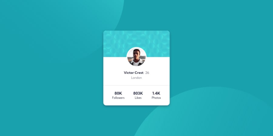
I have created this Profile Card Component Main using HTML and CSS In CSS i have use flexbox of layout.
Community feedback
- @hafizanadliPosted about 3 years ago
- better using semantic html (main,section,header,footer,etc) instead of using too many div
- Don't over qualifying selectors, if class name already specific, select by using that class name. for example if you want to select profile-pattern element in your project, you can simply select it by
.profile-pattern{..}instead of.main .container .profile-card .profile-pattern {...}
Marked as helpful0 - @raheemalzeeshanPosted about 3 years ago
Thank you 😀 for your helpful comment
0
Please log in to post a comment
Log in with GitHubJoin our Discord community
Join thousands of Frontend Mentor community members taking the challenges, sharing resources, helping each other, and chatting about all things front-end!
Join our Discord
