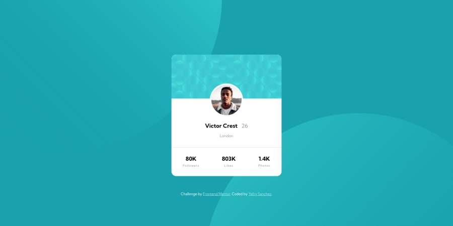
Design comparison
Solution retrospective
Any feedback is appreciated.
Community feedback
- @correlucasPosted over 2 years ago
👾Hello Yefry, congratulations for your solution!
I liked the work you've done with the
background-positionand the component flexibility, this was the hardest part with this challenge.Note that when you screen start to scale, the card stats start to pop out the container, you can fix this changing the
font-sizeor adding a media query to change this section flow vertically. See the media query example below:@media (max-width: 300px) {.container__content__data { border-top: 1px solid var(--Dark-grayish-blue); display: flex; justify-content: space-around; flex-direction: column; }}Hope it helps, congratulations!
1@y25sanchezPosted over 2 years ago@correlucas Thanks for all your advices, I will definitely implement all your recommendations. I hope you having a great day so far.
1@correlucasPosted over 2 years ago@y25sanchez Happy to hear that Yefry, happy coding for you!
0
Please log in to post a comment
Log in with GitHubJoin our Discord community
Join thousands of Frontend Mentor community members taking the challenges, sharing resources, helping each other, and chatting about all things front-end!
Join our Discord
