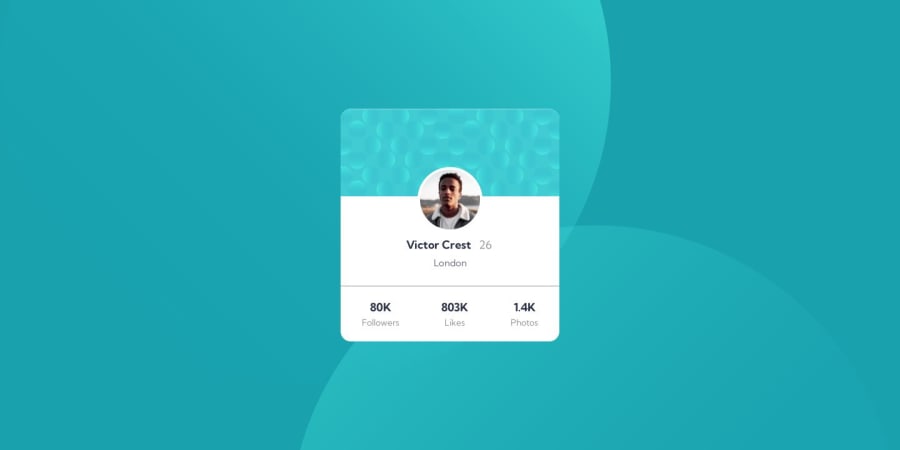
Design comparison
Solution retrospective
Hi everyone!
I haven't really had any problems in this. However, I am unsure of the coding practices I used on this one. Please give me feedback on that.
Community feedback
- @MelvinAguilarPosted about 1 year ago
Hello there 👋. Good job on completing the challenge !
I have some suggestions about your code that might interest you.
- Wrap the page's whole main content in the
<main>tag.
-
Avoid using
overflow-hiddenon your main container because it prevents scrolling on small screens like mobile devices.Also,
w-screenmight be unnecessary since, by default, it occupies 100% of the screen width and could lead to unnecessary horizontal scrollbars.
- Using two images is a solid solution, but consider creating a custom class in Tailwind and applying it as a background-image.
-
Consider centering it using Flexbox or Grid layout instead of
absolute. The latter might cause content overflow on smaller screens.<div class="flex justify-center items-center min-h-screen"></div>or
<div class="grid place-items-center min-h-screen"></div>
I hope you find it useful! 😄 Above all, the solution you submitted is great!
Happy coding!
0 - Wrap the page's whole main content in the
- @Arman001Posted about 1 year ago
Hi!
Good work. It is not scaling down properly and on mobile it gets very compressed because of your auto scaling may be.
Regards
Saad
0
Please log in to post a comment
Log in with GitHubJoin our Discord community
Join thousands of Frontend Mentor community members taking the challenges, sharing resources, helping each other, and chatting about all things front-end!
Join our Discord
