Design comparison
SolutionDesign
Solution retrospective
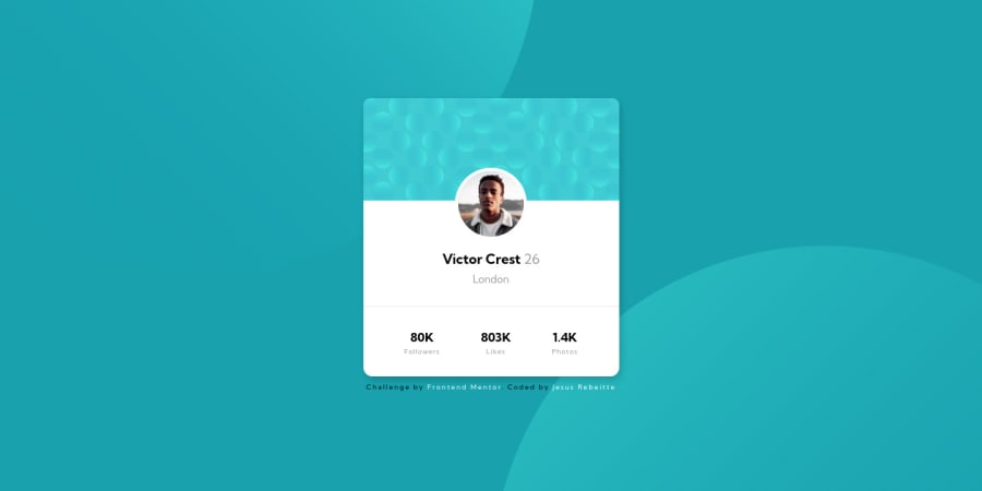
For this challenge I practice a little of flexbox, the background circles were a challenge, I used z-index to put it behind the card, and position: absolute to move it, however, I'd like to know if there’s a better way to do it, I tried adding the two circles using background-image: url(''), url('') but it doesn't work well when I tried to move it to reach the desired design
Community feedback
Please log in to post a comment
Log in with GitHubJoin our Discord community
Join thousands of Frontend Mentor community members taking the challenges, sharing resources, helping each other, and chatting about all things front-end!
Join our Discord
