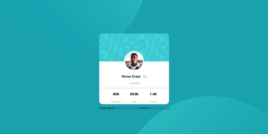
Design comparison
Solution retrospective
Please have a look at the code and also the preview( keep zoom at 100% ). I request everyone to suggest me improvements wherever necessary.
Community feedback
- @ApplePieGiraffePosted over 3 years ago
Hello there, ratan17! š
Good effort on this challenge! š
I'd like to suggest using flexbox to center the card component in the viewport (rather than using absolute positioning to do so), since absolute positioning is best used for elements that are particularly tricky to place, and in this case, flexbox would a great tool to use and make it easier to keep the design of the page responsive.
Simply add
min-height: 100vh
to thebody
(to ensure that it fills up the entire area of the screen) and,display: flex; align-items: center; justify-content: center;
...to the
body
, as well, in order to use flexbox. šKeep coding (and happy coding, too)! š
Marked as helpful3@ratan17Posted over 3 years ago@ApplePieGiraffe thanks for the feedback. I will surely watch some tutorials about flexbox
1
Please log in to post a comment
Log in with GitHubJoin our Discord community
Join thousands of Frontend Mentor community members taking the challenges, sharing resources, helping each other, and chatting about all things front-end!
Join our Discord