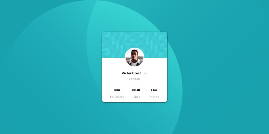
Design comparison
Solution retrospective
My first challenge. If there is any suggestion, please let me know.
Community feedback
- @rsrclabPosted almost 3 years ago
Hi, @niicodeer ~
Congratulate on your solution to the challenge on FM platform. I have studied your work carefully and learned a lot from it. Especially I like BEM structuring on your project.
Here are some of the tips I like to provide.
- On smaller devices, card goes over screen, and I think
max-width: 100%can solve this issue. - Please try BEM for naming element classes. It will help you a lot on bigger projects.
- For background, I suggest you to use css
background-imageproperty or pseudo elements like::before, ::after.
https://www.frontendmentor.io/solutions/profile-card-solution-m-cH4D2Lp
Here is my solution to this challenge, and if it can help you even a bit, it would be happy to me.
Cheers ~
Marked as helpful1@niicodeerPosted almost 3 years ago@tymren608 Hey, thanks for the tips! They helped me correct the errors with the background and the card stuff, a new thing learned. Again, thanks you so much!
Cheers
0 - On smaller devices, card goes over screen, and I think
Please log in to post a comment
Log in with GitHubJoin our Discord community
Join thousands of Frontend Mentor community members taking the challenges, sharing resources, helping each other, and chatting about all things front-end!
Join our Discord
