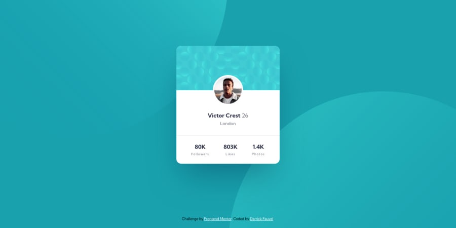
Profile card component - HTML, CSS, & Vite
Design comparison
Solution retrospective
Hi everybody, π
I found placing the circles as background images to be challenging π₯, as I used a few media queries to make them respond to varying screen sizes. π€·ββοΈ
If I've missed anything or you think I could do something better, please let me know. I appreciate your feedback. π₯°
π Happy codding!
Community feedback
- @hcxwebPosted over 2 years ago
Hello Darrick,
To save you the hassle of writing media query for the background, try something like: background-image: url("images/bg-pattern-top.svg"), url("images/bg-pattern-bottom.svg"); background-position: right 50vw bottom 40vh, left 50vw top 50vh; background-repeat: no-repeat;
Marked as helpful1@DarrickFauvelPosted over 2 years ago@hcxweb Wow! π² That is so much simpler, and it works perfectly.
Solution updated!
I knew there was a better way. I'm glad I mentioned my media query struggle.
Thank you so much for responding with a great solution! π
0 - @NaveenGumastePosted over 2 years ago
Hello Darrick Fauvel ! Congo π on completing this challenge
Let's look at some of your issues, shall we:
- the color the numbers is very dark then the original design so reduce the opacity a little.
happy Codingπ
Marked as helpful1@DarrickFauvelPosted over 2 years ago@Crazimonk I definitely missed that on both the numbers and profile name.
Solution updated!
Thank you so much! π
1
Please log in to post a comment
Log in with GitHubJoin our Discord community
Join thousands of Frontend Mentor community members taking the challenges, sharing resources, helping each other, and chatting about all things front-end!
Join our Discord