Design comparison
SolutionDesign
Solution retrospective
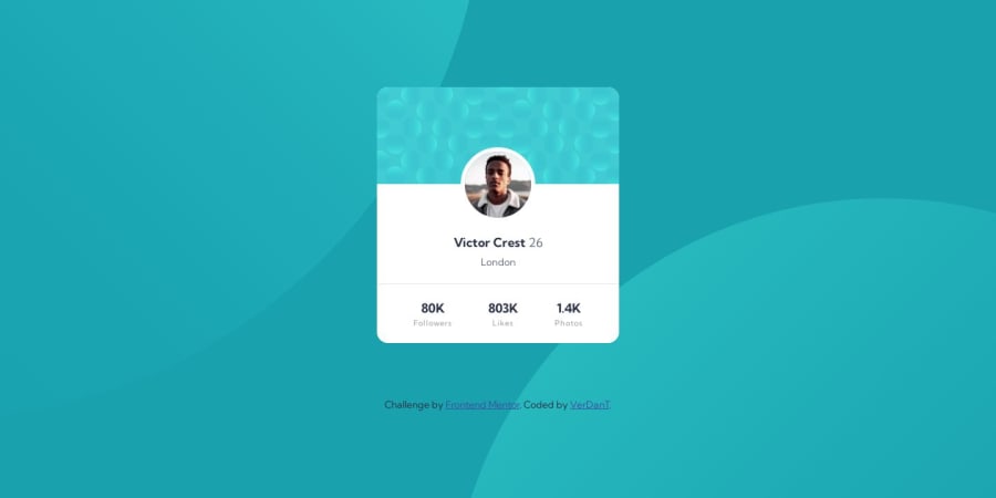
💻 Proyect built with pure HTML and CSS 🤓
In this component, what was most difficult for me was the background, those patterns. I couldn't get them positioned correctly, and I had an issue with overflow-X on mobile. Well, I think the component turned out well in the end, but I also believe it could be improved. If anyone has any tips regarding this, I would greatly appreciate it.
Community feedback
Please log in to post a comment
Log in with GitHubJoin our Discord community
Join thousands of Frontend Mentor community members taking the challenges, sharing resources, helping each other, and chatting about all things front-end!
Join our Discord
