Design comparison
SolutionDesign
Solution retrospective
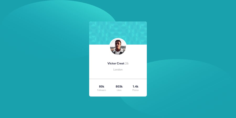
I created this simple page using HTML & only CSS Flex as a layout. I'm open to any questions and critics,
Community feedback
- @ericsalviPosted over 3 years ago
This is pretty solid. Great job.
Two things for you to consider. The background circles get distorted on mobile. Is there a way you can rework your code to make it more responsive? I would play around with that a bit more.
Also, your code is using flex so it is always a great practice to run all of your CSS through a prefixer. I use https://autoprefixer.github.io/ for all of my code. This way it makes sure your code is compatible with all major browsers.
Keep up the momentum!
0
Please log in to post a comment
Log in with GitHubJoin our Discord community
Join thousands of Frontend Mentor community members taking the challenges, sharing resources, helping each other, and chatting about all things front-end!
Join our Discord