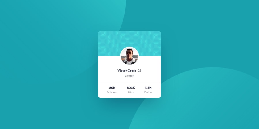
Design comparison
Solution retrospective
Not happy with the way the background came out on the mobile view, but it is what it is! This challenge was perfect for more general SCSS, BEM, and deployment practice.
Community feedback
- @mattstuddertPosted almost 4 years ago
Hey Lynette, excellent work on this challenge! How come you're not happy with the background on mobile? I think you've done a great job!
Here are a few pointers after taking a look at your code:
- You're not using any headings elements at the moment. Headings are important for creating a proper content hierarchy. This is especially helpful for screen reader users, as screen readers will use headings to structure the content. I'd recommend adding headings to add this hierarchy. For this design, I'd say the person's name is the
h1
and the "Followers", "Likes", "Photos" are theh2
headings. - Be sure the use semantic HTML5 structural elements in your projects. As this is just a single component, it's not a huge deal, but you could have it wrapped in a
main
and asection
to add that extra meaning. - You've added the pattern at the top of the card as an
img
in the HTML with analt
attribute for screen reader users. As this image is purely decorative, it would be best to either add it as abackground-image
in the CSS or leave the alt attribute blank, so that screen readers skip over it.
I hope you find these tips useful and you enjoyed the challenge. Keep up the great work!
1 - You're not using any headings elements at the moment. Headings are important for creating a proper content hierarchy. This is especially helpful for screen reader users, as screen readers will use headings to structure the content. I'd recommend adding headings to add this hierarchy. For this design, I'd say the person's name is the
- @RitikBiruaPosted almost 4 years ago
It is awesome.will you mind telling me how your design comparison preview is perfect?
0@lynettelopezPosted almost 4 years ago@RitikBirua Hi there! I'm a pro member, so I'm able to see the exact measurements they use in the original designs.
0
Please log in to post a comment
Log in with GitHubJoin our Discord community
Join thousands of Frontend Mentor community members taking the challenges, sharing resources, helping each other, and chatting about all things front-end!
Join our Discord