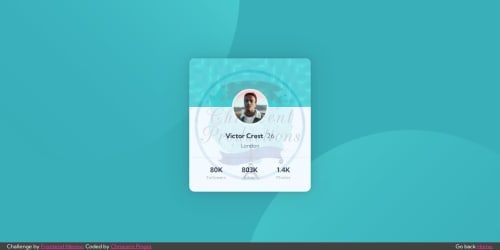
Submitted almost 2 years agoA solution to the Profile card component challenge
Profile Card Component - flexbox/grid mix
react
@KishonShrill

Solution retrospective
This challenge is done together with Blog Preview Card
- Both done within 12 hours
Unsure:
- Can someone check if the way I did my
<hr class="profile__divider" />correct? I feel like I could have done better on that part... - Also the banner of the card, i think the pattern is not aligned correctly, is the banner on the design a little scaled?
Code
Loading...
Please log in to post a comment
Log in with GitHubCommunity feedback
No feedback yet. Be the first to give feedback on Chriscent Pingol's solution.
Join our Discord community
Join thousands of Frontend Mentor community members taking the challenges, sharing resources, helping each other, and chatting about all things front-end!
Join our Discord