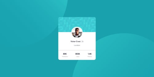
Design comparison
Solution retrospective
Can someone help me about media queries since i dont know much about it yet , as u can see i didnt achieve the mobile design , the container shrinks when i try it to other devices. Im a newbie so i hope u understand :)
Community feedback
- @danielmrz-devPosted 12 months ago
Hello @ivara21!
Media queries allow you to apply CSS styles depending on a device's general type (such as print vs. screen) or other characteristics such as screen resolution or browser viewport width.
I think the best option is to use the mobile first approach and then using media queries to create versions of your project for bigger screen sizes. It seems a lot easier to do that once the mobile version is finished.
When you finish your mobile version, you use
@media
to style your project for bigger screen sizes like this:Example: @media (min-width: 768px) { CSS code here }
That pixel number is not random, is the breakpoint you set. In this example you are saying that your project is gonna behave one way until it reaches that number. Once the screen is bigger than that, the code inside your media queries overrides the previous one.
You don't need to create a whole new style for your project for bigger screens, you just need to change what you need. The parts you don't change will remain the same.
This is a very brief explanation on how media queries work. I recommend you do your research on the topic. It's not that hard 😊
0
Please log in to post a comment
Log in with GitHubJoin our Discord community
Join thousands of Frontend Mentor community members taking the challenges, sharing resources, helping each other, and chatting about all things front-end!
Join our Discord