Design comparison
SolutionDesign
Solution retrospective
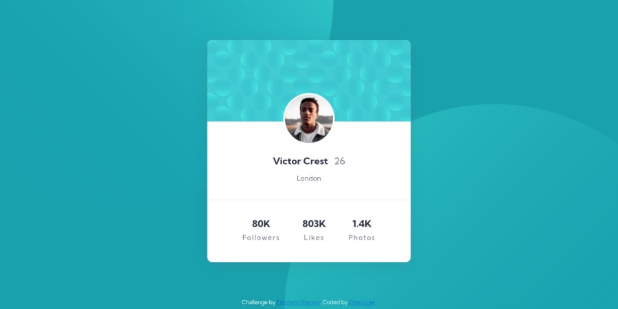
Hello, this is my third time trying a FrontEnd Mentor challenge. I've been practicing to get comfortable with the Box Model using CSS, and I also want to get more familiar with different layouts and designs.
How does this look like on different adaptive screens? Is there a more efficient way of achieving a centered and organized layout? Are there any improvements I can make with my code?
Community feedback
Please log in to post a comment
Log in with GitHubJoin our Discord community
Join thousands of Frontend Mentor community members taking the challenges, sharing resources, helping each other, and chatting about all things front-end!
Join our Discord
