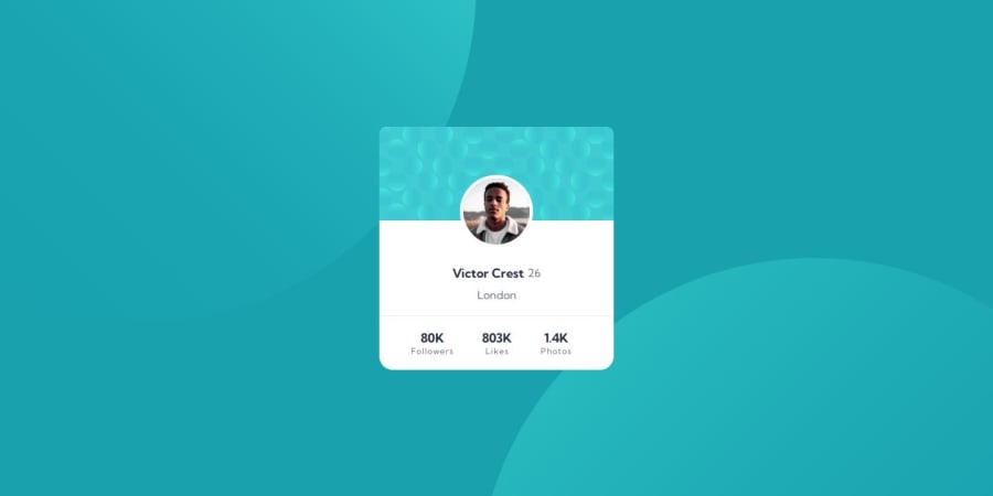
Design comparison
Solution retrospective
This challenge helped me to practice more the use of the "position" property. An easy but tricky challenge. It feel great to complete this challenge! I'm proud that i successfully complete this challenge.
What challenges did you encounter, and how did you overcome them?Positioning the image where it should be, the background circles and for some reason, the middle text from the footer didn't look align to the center, even when all the containers and text were aligned. For the pfp image, i saw a YT video to get an idea, and using the developers tool i got the values after playing around for a while. for the text on the footer, i used margins (i didn't want to, but it was the only way i figured it out to solve the problem), and for the background, i tried a lot of values, without good results, but thanks to a comment from @danielmrz-dev on another post of the same challenge, i was able to get the results i wanted for the "background position" property! :)
What specific areas of your project would you like help with?Any feedback is more than welcome!
Community feedback
Please log in to post a comment
Log in with GitHubJoin our Discord community
Join thousands of Frontend Mentor community members taking the challenges, sharing resources, helping each other, and chatting about all things front-end!
Join our Discord
