Design comparison
Solution retrospective
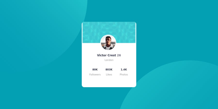
what i called this experience it takes 3 hour to built. Many trouble happen with me when i create web 1. when I create page by flex card image is on there right place but when I add heading on Html it takes the image place and and width of the div of was automaticaly changed and 62 was in same heading but it gone to secound line I am biggener so, I choose the positioning way to fix the problem It seems like i need more practice of flex box to fix the problem with positioning it takes me 2 hour. at the end I am happy to see the preview but I am not satisfied with my css code
Community feedback
- @rsrclabPosted almost 3 years ago
Hi, @Ganesh-Rathor ~
Congratulate on your solution to the challenge on FM platform. I have studied your work carefully and learned a lot from it. Especially I like the way you did background. Especially I like BEM structuring on your project.
Here are some of the tips I like to provide.
- Card container goes full width of the screen, and I think
max-width: 100%can solve this issue. - Please try BEM for naming element classes. It will help you a lot on bigger projects.
- Font sizes and spacings aren't the same with design. As a front-end developer, it's important to meet pixel-perfect requirements.
https://www.frontendmentor.io/solutions/profile-card-solution-m-cH4D2Lp
Here is my solution to this challenge, and if it can help you even a bit, it would be happy to me.
Cheers ~
Marked as helpful1 - Card container goes full width of the screen, and I think
Please log in to post a comment
Log in with GitHubJoin our Discord community
Join thousands of Frontend Mentor community members taking the challenges, sharing resources, helping each other, and chatting about all things front-end!
Join our Discord
