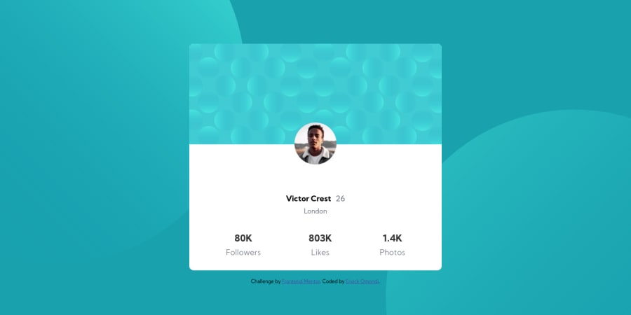
Design comparison
Solution retrospective
Worked on the card component challenge and i know it is not the best but i would request for your feedback so that can improve where necessary.
Community feedback
- @tomasgoddyPosted over 4 years ago
Hi Enock Great job
1 - @MilitusInnocentPosted over 4 years ago
Great job Enock, however, you could consider reducing the width of the container. Try using px for the width, I think a hard code value will give you the desirable result you want.
1@Trend20Posted over 4 years ago@MilitusInnocent Thanks for the compliment. I will surely make it more adorable.
1 - @abhik-bPosted over 4 years ago
Hi Enock 👋, Your solution looks good , well done
- your card looks good on mobile however for big screens its too wide (
width:360pxor something similar can fix it ) - your background images are aligned great on desktop devices, use
media-queriesto properly align the background images on mobile
Great work , Keep it up 💯
0@Trend20Posted over 4 years ago@abhik-b Thanks for the compliment. I will make make the necessary corrections.
1 - your card looks good on mobile however for big screens its too wide (
Please log in to post a comment
Log in with GitHubJoin our Discord community
Join thousands of Frontend Mentor community members taking the challenges, sharing resources, helping each other, and chatting about all things front-end!
Join our Discord
