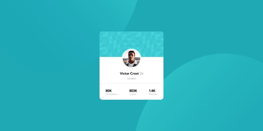
Design comparison
SolutionDesign
Solution retrospective
What are you most proud of, and what would you do differently next time?
I have successfully achieved a polished and professional design for the card component.
What challenges did you encounter, and how did you overcome them?I faced the challenge of positioning the image precisely within the card component according to the design specifications. To overcome this, I used design tools for accurate placement and ensured a polished final design.
What specific areas of your project would you like help with?I initially faced challenges with adding the SVG background image to the component. I would appreciate assistance in properly implementing it.
Community feedback
Please log in to post a comment
Log in with GitHubJoin our Discord community
Join thousands of Frontend Mentor community members taking the challenges, sharing resources, helping each other, and chatting about all things front-end!
Join our Discord
