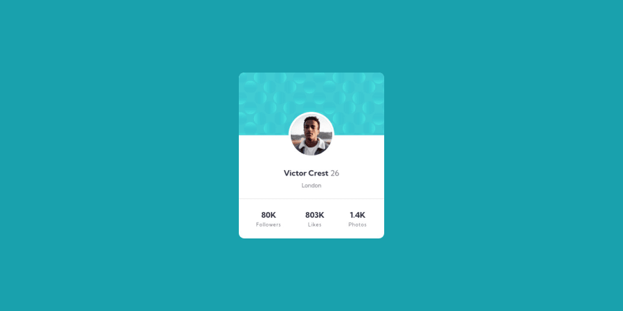
Design comparison
Solution retrospective
Anything that I can do to improve my code ?
Any feedback are appreciated !!
Community feedback
- @correlucasPosted about 2 years ago
👾Hello Soytto, congratulations for your new solution!
👨💻 Here’s some tips to improve your solution code:
1.The approach you've used to center this card vertically is not the best way, because using margins you don't have much control over the component when it scales. My suggestion is that you do this alignment with
flexboxusing the body as a reference for the container.The first thing you need to do is to remove the margins used to align it, then apply
min-height: 100vhto the body to make the child (the card/container) align to its size that now will be displaying 100% of the viewport height and then give its alignment withdisplay: flexandalign-items: center/justify-items: center.2.When the card gets stretched the
statssection gets a little bit too near and not fitting good together, something you can do to improve the card responsiveness is create a media query for thestats sectionand make each stat number stay in a different row aftermax-width: 350pxusing a media query, here's the code for that:@media (max-width: 350px) { footer { display: flex; flex-direction: column; } }✌️ I hope this helps you and happy coding!
Marked as helpful0@SoyttoPosted about 2 years ago@correlucas hey ! Thanks for your message !
To be honest, I don't understand the 1st part very well... I already use "display: flex and align-items: center / justify-items: center", with a "min-height: 100vh" I used margin in the footer part because "space-between" didn't take all space :/
However I didn't think about the responsiveness, I just change that, thank you so much !!
1
Please log in to post a comment
Log in with GitHubJoin our Discord community
Join thousands of Frontend Mentor community members taking the challenges, sharing resources, helping each other, and chatting about all things front-end!
Join our Discord
