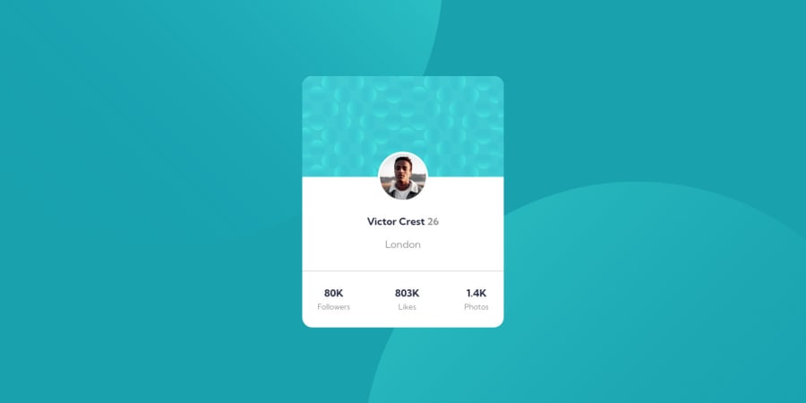
Profile card component (HTML, SASS, FLEXBOX, BEM)
Design comparison
Solution retrospective
Hey there! 🫡 this is Nacho
This is my solution of the "Profile card component"
How was my experiencie in this project?
Was very funny, I finished it in two hours. I've had a problem with the backgrounds but I fixed it right away
What I used in this project?
- HTML
- SASS
- BEM
- Mobile-first workflow
I have some questions:
- Is my code okay?
- I have something to improve?
I want to know your feedback! any tip or advice are helpful and welcome!
Cheers!
Community feedback
- @Rajesh7rjPosted almost 2 years ago
Hey @ignaciofigueroadev, Great Work Buddy 👏.
I saw your design it looks great but there are few things we can change and correct them. I think card height seems little big so you can set card height.
Also in mobile view your card seems same as desktop view, you can change font size and scale up your card dimensions according to mobile-design.jpg file which given in the resources.
You can use @media-query method for responsive website. You can check this link for that : https://www.w3schools.com/css/css_rwd_mediaqueries.asp
I hope you can understand this and improve your code. But again it was great attempt for your side.
Wish you a best of luck! ✌️ Keep Learning.... Keep Coding.....
Thanks! Rajesh Janyani
1@ignaciofigueroadevPosted almost 2 years ago@Rajesh7rj I really appreciate your comment!
0
Please log in to post a comment
Log in with GitHubJoin our Discord community
Join thousands of Frontend Mentor community members taking the challenges, sharing resources, helping each other, and chatting about all things front-end!
Join our Discord
