Design comparison
Solution retrospective
Hello Coders,
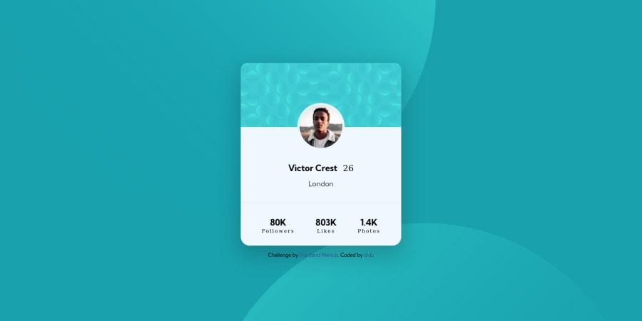
My second project. Hope to get some feedback:) I had some trouble with positioning the bg-pattern-bottom.svg and bg-pattern-top.svg. When I resize my browser the two svg's are not resizing(shrinking) . How can I code this so that they size when I resize the browser?
Another question, on my image I have:
img{ max-width: 100%; }
When I use width: 100% the image gets bigger.
Which one is the best option? and why.
Thanks for the feedback
greetings, Danny
Community feedback
- @madkn1311Posted almost 3 years ago
Hello Danny,
Good job on the design..!!
It is good practice to apply background on the body instead of the html tag.
body{ background-image: url(./images/bg-pattern-top.svg), url(./images/bg-pattern-bottom.svg); background-position: right 48vw bottom 30vh, left 45vw top 48vh; background-repeat: no-repeat, no-repeat; }- When we use
max-width:100%it means that the width of that particular element will be between 0-100% and not more than that. - So when we use max-width it adjusts the size of the image according to the screen size, as compared to width, which will always keep the images in their original size.
I hope this was helpful. :)
Marked as helpful1@dvbenthemPosted almost 3 years ago@madkn1311
Thanks for the feedback! And for clarifying the use of max-width.
I will add in the future the background images in the body instead of html tag.
Thanks again!
1 - When we use
Please log in to post a comment
Log in with GitHubJoin our Discord community
Join thousands of Frontend Mentor community members taking the challenges, sharing resources, helping each other, and chatting about all things front-end!
Join our Discord
