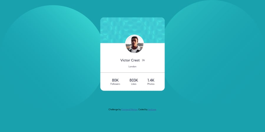
Design comparison
Solution retrospective
Hello devs, did this now. But I need help with the two different background images, I can't get to fit it like the actual design's. Please help and give feedbacks, cheers.
Please log in to post a comment
Log in with GitHubCommunity feedback
- P@12Kentos
Hey @theCephas,
Nice job on the project, looks great! You had the right idea with setting the background settings, but instead of background image try the following.
background: url(images/bg-pattern-top.svg) right 50vw bottom 40vh no-repeat, url(images/bg-pattern-bottom.svg) 50vw 50vh no-repeat;You can also combine the no repeat, and positioning into the same line, like in the example I gave.
Keep up the great work!
Join our Discord community
Join thousands of Frontend Mentor community members taking the challenges, sharing resources, helping each other, and chatting about all things front-end!
Join our Discord
