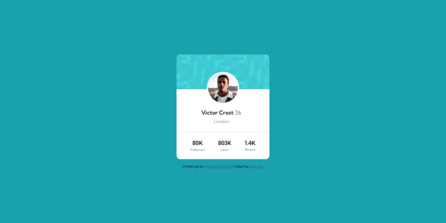
Design comparison
Solution retrospective
was easy
(i forgot about the background and i accidentally used 2 screenshots so i'm not gonna add it)
What challenges did you encounter, and how did you overcome them?no challenges
What specific areas of your project would you like help with?please give feedback
Please log in to post a comment
Log in with GitHubCommunity feedback
- P@danielmrz-dev
Hello there!
Congrats on completing the challenge! ✅
Your solution looks great!
The background pattern with the circles is a bit tricky, and you said you're not gonna add it, but you can do it with only 4 lines of code... So just in case you change your mind about it, here's how you can do it:
📌 Add this to the body:
  background-color: var(--Dark-cyan);
  background-image: url("./images/bg-pattern-top.svg"), url("./images/bg-pattern-bottom.svg");
  background-repeat: no-repeat, no-repeat;
  background-position: right 52vw bottom 35vh, left 48vw top 52vh;
I hope it helps!
Other than that, you did an excelent job!
Marked as helpful
Join our Discord community
Join thousands of Frontend Mentor community members taking the challenges, sharing resources, helping each other, and chatting about all things front-end!
Join our Discord
