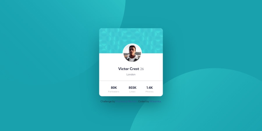
Design comparison
Solution retrospective
Hey guys,
Please check my code. :) I will be very grateful for every valuable comment. Have a great day today.
Mileenka
Community feedback
- @VCaramesPosted about 2 years ago
Hey there! 👋 Here are some suggestions to help improve your code:
-
The purpose of the Main Element is to identify the main content of your page. It is not the container of you component. After the main element, you want add a container to wrap you separate components in.
-
The only heading in this challenge is “Victor Crest”. Everything else should be wrapped in a Paragraph Element.
-
The statistics are a list. They need be created using the Unordered List along with the List Element.
If you have any questions or need further clarification, let me know.
Happy Coding! 👻🎃
1 -
- @Shady-OmarPosted about 2 years ago
Hello, Good job on completing this challenge !!
My advice here is to use
display: flex;
to horizontally center your avatar instead of using margin property for better accuracy as you see the image it not well centered.Other than that all seems good, Hope this helps
keep going, Enjoy coding !!
1
Please log in to post a comment
Log in with GitHubJoin our Discord community
Join thousands of Frontend Mentor community members taking the challenges, sharing resources, helping each other, and chatting about all things front-end!
Join our Discord