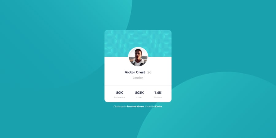


Design comparison

Solution retrospective
Any feedback for cleaner and more efficient code is welcome!
Community feedback
- @correlucasPosted about 2 years ago
👾Hello Kenisa, Congratulations on completing this challenge!
I saw your preview site and I liked a lot the work you’ve done here, it's almost complete, I’ve some suggestions you can consider applying to your code:
1.There's no need to set the
container heightthe height its automatic and the container grows with the size/spacing of its content. If you set theheightthe container will stop to grow after reach the height set:.card { background-color: var(--white); border-radius: 1rem; width: 100%; /* max-height: 23.5rem; */ }2.When the card gets stretched the
statssection gets a little bit too near and not fitting good together, something you can do to improve the card responsiveness is create a media query for thestats sectionand make each stat number stay in a different row aftermax-width: 350pxusing a media query, here's the code for that:@media (max-width: 350px) { .stats-list { display: flex; flex-direction: column; justify-content: space-around; } }✌️ I hope this helps you and happy coding!
Marked as helpful0

Please log in to post a comment
Log in with GitHub
Join our Discord community
Join thousands of Frontend Mentor community members taking the challenges, sharing resources, helping each other, and chatting about all things front-end!
Join our Discord