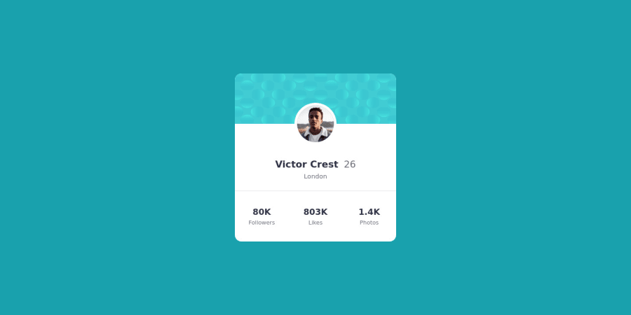
Profile card component using CSS Grid [Fixed Width & Height]
Design comparison
Community feedback
- @malek-btPosted almost 2 years ago
Hey !, how are you ? I really liked the result of your project, but I have some tips that I think you will enjoy:
1.the background images must be like this:
body {background: url("images/bg-pattern-top.svg") , url("images/bg-pattern-bottom.svg") ;height: 50% 50%;background-color: hsl(185, 75%, 39%);background-repeat: no-repeat, no-repeat;background-position: right 48vw bottom 40vh, left 50vw top 40vh;}2.I see your README file is MAL structured. README is a very important aspect of making projects, especially if you want other people to see it. You should read the README file and the README-template file to make nice one.
The rest is good, I hope those tips will help you! 👍
Marked as helpful1@pankaj512Posted almost 2 years ago@malek-bt Hi Thanks for review.
I did not understand the need to use VH, VW units to align the images? Is it possible to use % here?
Also, I remove the height 50% 50% and it still works same. Why this 50% 50% split is required here?
I think the these image background are for main tag, not full body. We want to limit the website width in given size for desktop and mobile. So I set those on main instead of full body. If you see provided screenshot then they show white background around the content.
0
Please log in to post a comment
Log in with GitHubJoin our Discord community
Join thousands of Frontend Mentor community members taking the challenges, sharing resources, helping each other, and chatting about all things front-end!
Join our Discord
