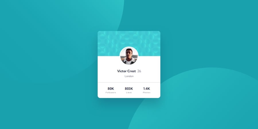
Design comparison
Solution retrospective
Project description: This is a perfect challenge to test your layout skills. The card layout doesn't shift, so it's also great for those that haven't dived into responsive websites yet!
Centering the stats
To center the stats like the design, I had to use Grid, setting a fixed width for each set with grid-template-columns: repeat(auto-fit, 77px). If you’re going with flexbox, you'll need to use flex-basis for each element.
The stats labels: followers, likes and photos.
I switched them from display: inline to display: block, so they break to a new line.
Removing the height of the line
To achieve the pixel-perfect height for the card, I used a pseudo-element to remove that one-pixel height from the line separating the profile header from the stats:
.ghost-line {
  position: relative;
  width: 100%;
  height: 0px;
}

.ghost-line::after {
  content: '';
  position: absolute;
  left: 0;
  right: 0;
  top: 0;
  height: 1px;
  background-color: var(--dark-gray);
  opacity: 0.5;
}
Wondering about the circle shape sizes?
I don’t have the Figma file for this project, but I think the shapes are:
- Desktop: 978px square
- Mobile: 601px square
Now you just gotta do your math to position them right like in the design! 🔎
What challenges did you encounter, and how did you overcome them?Getting those circle shapes and the stats elements to fit just right can be a real challenge!
What specific areas of your project would you like help with?Anything. Thank you so much for your time and effort in evaluating this.
Community feedback
Please log in to post a comment
Log in with GitHubJoin our Discord community
Join thousands of Frontend Mentor community members taking the challenges, sharing resources, helping each other, and chatting about all things front-end!
Join our Discord
