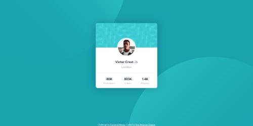
Profile card component

Solution retrospective
Hello everyone! Thanks for checking my solution code to the Profile card component challenge.
In my learning process I found that positioning the avatar profile's card isn't as simple as I thought. There are several methods here to achieve this, and I'm not sure I used one correctly, although it comes out responsive in different screens.
.profile-photo {
  position: relative;
  margin-top: 140px;
  display: flex;
  justify-content: center;
}

.profile-photo img {
  position: absolute;
  top: -55px;
  border-radius: 100%;
  border: 5px solid var(--white);
}
The same in the process of creating a dividing line, I wasn't sure how to create a full line without the padding attribute affecting it. So I tried this solution:
<div class="profile-container-top">...</div>
<div class="divider"></div>
<div class="profile-container-bottom">...</div>
.divider {
  border-top: 1px solid hsl(0, 5%, 92%);
}
Special thanks to @debriks for her solution how to create body background with images.
Please log in to post a comment
Log in with GitHubCommunity feedback
No feedback yet. Be the first to give feedback on Kira Weizman Shapira's solution.
Join our Discord community
Join thousands of Frontend Mentor community members taking the challenges, sharing resources, helping each other, and chatting about all things front-end!
Join our Discord