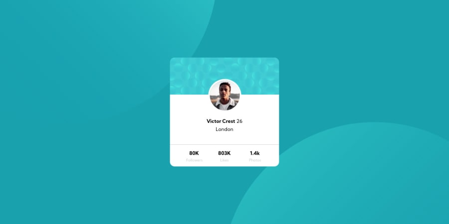
Design comparison
SolutionDesign
Solution retrospective
Requesting Feedback
Community feedback
- @artimysPosted almost 4 years ago
Nice work Soodmax, it looks close to the design. I have a few minor suggestions:
- I'm not sure if the "Followers", "Likes", and "Photos" list warrants to be in a
<nav>but if it does I recommend anchor tags in your<li> - double check on the font-color for
p.nameand London<p>tags - font-color also looks really light for "Followers", "Likes", and "Photos"
- Be sure to add text to an image's
altattribute for accessibility
Keep it up and have fun coding!! 👍
0 - I'm not sure if the "Followers", "Likes", and "Photos" list warrants to be in a
- @ApplePieGiraffePosted almost 4 years ago
Hey, good job on this challenge, soodmax! 🙌
Your solution looks good! 👍
I suggest using the
<strong>tag rather than the<b>tag to make the name in the title of the card bold—apparently, it's better for semantic meaning and a little less confusing in its original use than<b>. 😉 Also, giving your page a title with the<title>tag would be a nice touch!Keep coding (and happy coding, too)! 😁
0
Please log in to post a comment
Log in with GitHubJoin our Discord community
Join thousands of Frontend Mentor community members taking the challenges, sharing resources, helping each other, and chatting about all things front-end!
Join our Discord
