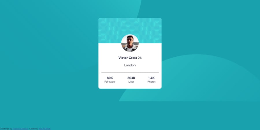
Design comparison
SolutionDesign
Solution retrospective
All Feedbacks are Welcome. Thank You and Happy Coding🎈
Community feedback
- @correlucasPosted over 2 years ago
👾Hello Asif, congratulations for your new solution!
Your solution is great but I've a better idea for the background-image circles:
You can add these two circles as a background, adding it to the body with two keys properties,
background-imageandbackground-position, note that the comma inside each properties declare the single modification for each circle separated.To align the two circle as
background-imagebackground-image: url(../images/bg-pattern-top.svg), url(../images/bg-pattern-bottom.svg); background-repeat: no-repeat, no-repeat; background-position: top -500px left -400px, bottom -700px right -250px; background-color: hsl(185, 75%, 39%);Use this for the alignment:
body {
    min-height: 100vh;
    text-align: center;
    display: flex;
    justify-content: center;
    align-items: center;
}
👋 I hope this helps you and happy coding!
0
Please log in to post a comment
Log in with GitHubJoin our Discord community
Join thousands of Frontend Mentor community members taking the challenges, sharing resources, helping each other, and chatting about all things front-end!
Join our Discord
