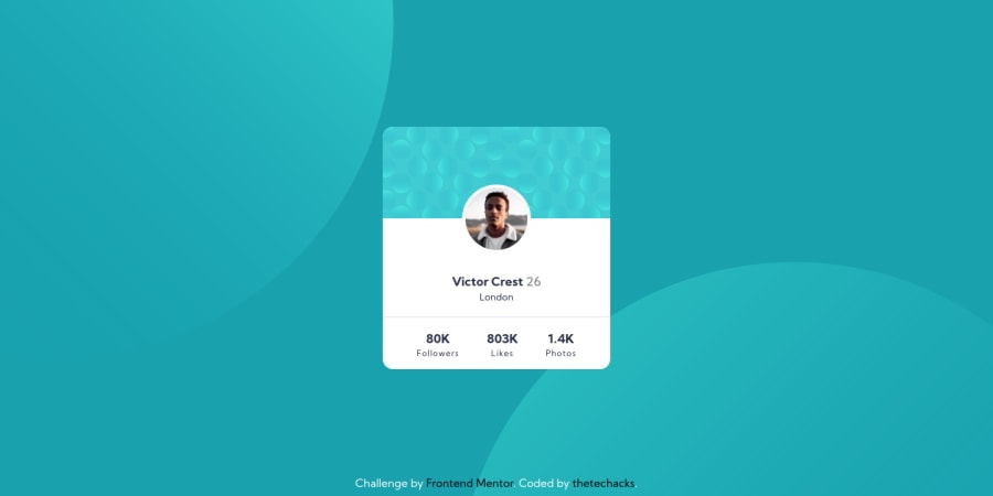
Profile Card Challenge Using HTML and SCSS
Design comparison
Solution retrospective
If you have any feedback I'd be glad to hear it.
Community feedback
- @pikapikamartPosted about 4 years ago
Hey, great work on this one.
Layout looks good in desktop and in mobile state as well.
Though when opening up dev tools, your layout gets squished in the middle, and I suspected,
height: 100vhis declared in yourbgselector.Instead of that, use
min-height: 100vhwhich will be a lot better. But still, your layout won't work because youabsolutethecardselector which I think not the right choice in here. You want it to be captured by the parent, so making itstaticorrelativeis the betters ones.So in your
cardselector. Remove this propertiesposition: absolute; transform left and topAnd in your
bgselector. You want to add something likealign-items: center; display: flex; justify-content: center; padding: add a padding to the top and bottom;This will make your content properly aligned in the center while making element in the flow which is a lot better.
If you need help regarding those suggestion, just drop it here okay and i'll help you with it^
0@thetechacksPosted about 4 years ago@pikamart Hey I checked out the issue and it looks like this problem doesn't occur in my PC, but thanks for the suggestion. I will check that out. While I was looking through your suggestion, I think it's better to use
display: grid; place-items: center;Your ideas would be valuable :)0
Please log in to post a comment
Log in with GitHubJoin our Discord community
Join thousands of Frontend Mentor community members taking the challenges, sharing resources, helping each other, and chatting about all things front-end!
Join our Discord
