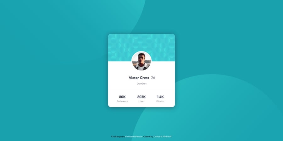
Profile card built with Semantic HTML 5, SASS and CSS
Design comparison
Solution retrospective
How was the use of my SASS?
It is the first time trying out the technology, even thought its a small project, I tried to use the features I learned, like mixins, partials and functions.
Any other feedback is welcomed! if something pops at you which you think I could improve, let me know.
Happy coding everyone! :-)
Community feedback
- @zyq-mPosted about 3 years ago
Sass is amazing technology to use. Once you use it you will never go back to pure css. Hahaha. In my opinion, you need to center your card properly. Feel free to take look at my solution.
Happy coding Carlos!!
https://www.frontendmentor.io/solutions/static-site-using-sass-and-bem-48zKADcKc
1@webshurikenPosted about 3 years ago@zyq-m Thanks for the feedback. I did notice the card not being centered and it is because I noticed that the card get wider on large screens after I uploaded my answer lol. Also the
<footer>was not removed from the visual flow so it takes space on the screen pushing my card up.Card is now centered but have to wait until next month to update the screenshot
Happy coding
0@zyq-mPosted about 3 years ago@CarlosEAM That's great Carlos!! You getting more improvement. Keep coding bro!!
0
Please log in to post a comment
Log in with GitHubJoin our Discord community
Join thousands of Frontend Mentor community members taking the challenges, sharing resources, helping each other, and chatting about all things front-end!
Join our Discord
