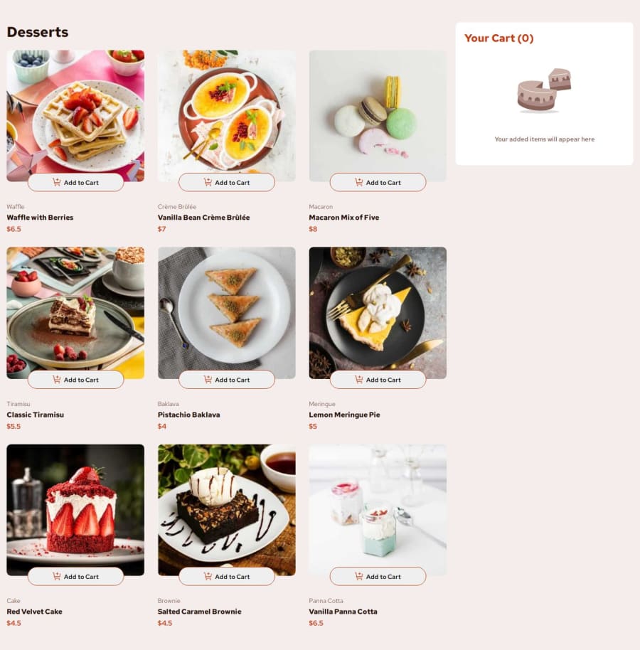


Design comparison

Community feedback
- @mathematiCodePosted 4 months ago
This is a pretty challenging project to make with just javascript. But you did a great job!
One note: For anything that the user needs to click as a button, make sure you wrap it in a button tag so it is accessible to people who only use keyboards and are unable to use a mouse.
<button class="decrement-button"> <img class="icon-decrement" src="assets/images/icon-decrement-quantity.svg" alt="icon-decrement-quantity"> </button> Then you can add the event listener to the button instead of the image so it can be clicked without using the mouse at all.
Nice job with the modal, that can be tricky. Sometimes people will want to close it just by clicking out of it in the backdrop area. But that is a lot easier with React; you can just use a component that someone else made.
All of your CSS looks great!
0 - P@tulucalexandruPosted 4 months ago
Hi there! Congratulations on your solution! I would suggest a few things in order to get it closer to the design:
- Image size seems to be a bit large
- Background color doesn't seem to be right
- The buttons seem different compared to design
- The total cart value is missing the decimals
Great effort! Happy coding!
0


Please log in to post a comment
Log in with GitHubJoin our Discord community
Join thousands of Frontend Mentor community members taking the challenges, sharing resources, helping each other, and chatting about all things front-end!
Join our Discord