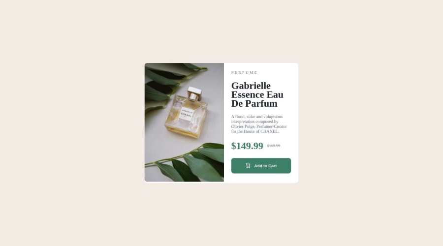
Design comparison
SolutionDesign
Community feedback
- @fernandolapazPosted over 1 year ago
Hi 👋🏻, in case you want to take a look:
HTML / ACCESSIBILITY:
- The main content of every page (the card in this case) should be wrapped with the
<main>tag.
- No need to wrap each element with a
<div>(unless you need it to group as in the case of prices) , better to use semantic elements like<img>,<h1>or<p>directly.
- You might be interested in using the <picture> element which is ideal to show different images depending on the device or screen size:
<picture> <source media="(min-width: 510px)" srcset="images/image-product-desktop.jpg"> <img src="images/image-product-mobile.jpg" alt="description"> </picture>- And if you don't want that white space under the image you can give it a height of 100%:
.image, .image img { height: 100% }- It would be better to capitalize 'Perfume' with CSS (using
text-transform: uppercase;) and not in HTML. Some screen readers will read out uppercased text as individual letters.
- The icon is a decorative image and therefore need an empty
altattribute to be ignored by a screen reader.
CSS:
- It might be good to get used to designing with the Mobile first approach, which means designing for mobile first and then for desktop or any other device, as it is widely considered best practice.
I hope it’s useful : )
Regards,
Marked as helpful0 - The main content of every page (the card in this case) should be wrapped with the
Please log in to post a comment
Log in with GitHubJoin our Discord community
Join thousands of Frontend Mentor community members taking the challenges, sharing resources, helping each other, and chatting about all things front-end!
Join our Discord
