

Design comparison

Solution retrospective
responsive design using media queries.
What challenges did you encounter, and how did you overcome them?none
What specific areas of your project would you like help with?font sizes and image sizes
Community feedback
- @correlucasPosted about 2 years ago
👾Hello @JoyObaidu, Congratulations on completing this challenge!
Your solution its almost done and I’ve some tips to help you to improve it:
1.Add the correct font for the main heading of this component. First of all you need to choose the font using
Google Fontshttps://fonts.google.com/ and import the code to drop on your CSS/HTML:This is the font for the H1:
font-family: 'Fraunces', serif;. There's two ways to import the font:- Using the html and inserting it to the
<head>
<head> <link rel="preconnect" href="https://fonts.googleapis.com"> <link rel="preconnect" href="https://fonts.gstatic.com" crossorigin> <link href="https://fonts.googleapis.com/css2?family=Fraunces:opsz,[email protected],700&display=swap" rel="stylesheet"> </head>- Using the CSS and adding to the first line of the CSS sheet:
@import url('https://fonts.googleapis.com/css2?family=Fraunces:opsz,[email protected],700&display=swap');2.You need to include the title of your PAGE. Do that inserting in the <head> the tag <title> →
<title>Product Preview Component - Front End Mentor</title>3.Use the THE PICTURE TAG that is a shortcut to deal with the multiple images in this challenge. So you can use the
<picture>tag instead of importing this as an<img>or using a div withbackground-image. Use it to place the images and make the change between mobile and desktop, instead of using adivorimgand set the change in the css withdisplay: nonewith the tag picture is more practical and easy. Note that for SEO / search engine reasons isn’t a better practice import this product image with CSS since this will make it harder to the image. Manage both images inside the<picture>tag and use the html to code to set when the images should change setting the devicemax-widthdepending of the device desktop + mobile.Check the link for the official documentation for
<picture>in W3 SCHOOLS:https://www.w3schools.com/tags/tag_picture.aspSee the example below:
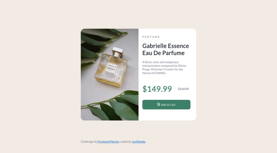
<picture> <source media="(max-width:650px)" srcset="./images/image-product-mobile.jpg"> <img src="./images/image-product-desktop.jpg" alt="Gabrielle Parfum" style="width:auto;"> </picture>👨💻Here's my solution for this challenge if you wants to see how I build it: https://www.frontendmentor.io/solutions/product-preview-card-vanilla-css-and-custom-hover-state-on-hero-85A1JsueD1
✌️ I hope this helps you and happy coding!
Marked as helpful0 - Using the html and inserting it to the

Please log in to post a comment
Log in with GitHub
Join our Discord community
Join thousands of Frontend Mentor community members taking the challenges, sharing resources, helping each other, and chatting about all things front-end!
Join our Discord