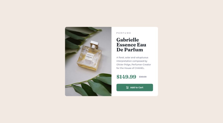
Design comparison
SolutionDesign
Solution retrospective
Hi, everyone.
I spent some time on this project and touched on the first solution. I know there are a lot of things here to fix. I couldn't set the image's brightness and my responsive design is so weak. I hope I can check some good examples and implement them to the second version of this project.
Any comments, critique, advice is greatly appreciated. For those of you reading this, have a nice day!
Community feedback
Please log in to post a comment
Log in with GitHubJoin our Discord community
Join thousands of Frontend Mentor community members taking the challenges, sharing resources, helping each other, and chatting about all things front-end!
Join our Discord
