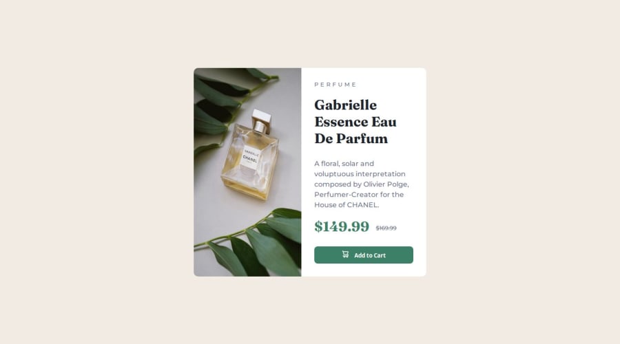


Design comparison
SolutionDesign

Solution retrospective
What are you most proud of, and what would you do differently next time?
I tried to learn to adjust the compatibility with the devices, and next time I will try to adjust more with the masking plug
What challenges did you encounter, and how did you overcome them?In general, you have to research a little, but in general, the time factor remains influential
What specific areas of your project would you like help with?I am in the learning stage and I want to make a lot of progress
Community feedback
- @0xabdulkhaliqPosted 12 months ago
Salaam Alaikum 👋. Congratulations on successfully completing the challenge! 🎉
- I have a suggestion regarding your code that I believe will be of great interest to you.
PiCTURE TAG 📸:
- Looks like you're currently using media queries for swapping different version of
image,
<div class="card-imag">
      <img class="imag-mobil" src="./images/image-product-mobile.jpg" alt="image-product-mobile">
      <img class="img-desk" src="./images/image-product-desktop.jpg" alt="image-product-desktop">
</div>
- So let me introduce the
pictureelement, it's commonly used for responsive images, where different image sources are provided for different screen sizes and devices, and for art direction, where different images are used for different contexts or layouts.
- Example:
<picture>
  <source media="(max-width: 768px)" srcset="small-image.jpg">
  <source media="(min-width: 769px)" srcset="large-image.jpg">
  <img src="fallback-image.jpg" alt="Example image">
</picture>
- In this example, the
<picture>tag contains three child elements: two<source>elements and an<img>element. The<source>elements specifies different image sources and the conditions under which they should be used.
- Using this approach allows you to provide different images for different screen sizes without relying on CSS, and it also helps to improve page load times by reducing the size of the images that are served to the user
- If you have any questions or need further clarification, you can always check out
my submissionand/or feel free to reach out to me.
.
I hope you find this helpful 😄 Above all, the solution you submitted is great !
Happy coding!
Marked as helpful0 - @homciAbdallahPosted 12 months ago
Thanks for the advice. Can you explain the meaning to me? Accessibility report He improved the project!!!!
0

Please log in to post a comment
Log in with GitHub
Join our Discord community
Join thousands of Frontend Mentor community members taking the challenges, sharing resources, helping each other, and chatting about all things front-end!
Join our Discord