

Design comparison

Solution retrospective
I'm still not training responsiveness.
Community feedback
- @ozzy1136Posted over 2 years ago
Take a look at the reference for the @media rule and you will be able to adjust styles based on how large the viewport width is: https://developer.mozilla.org/en-US/docs/Web/CSS/Media_Queries/Using_media_queries. So, you could write:
main {
  flex-direction: column;
}

@media screen and (min-width: 650px) {
  main {
    flex-direction: row;
  }
}
This way by default the card will be laid out vertically, but once the viewport gets too big it will place the items horizontally. Also, it is usually better to begin with the mobile design and build on top of that.
0 - @correlucasPosted over 2 years ago
👾Hello Yago, Congratulations on completing this challenge!
Your solution its almost done and I’ve some tips to help you to improve it:
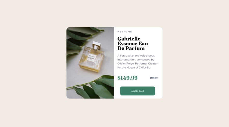
Use the THE PICTURE TAG that is a shortcut to deal with the multiple images in this challenge. So you can use the
<picture>tag instead of importing this as an<img>or using a div withbackground-image. Use it to place the images and make the change between mobile and desktop, instead of using adivorimgand set the change in the css withdisplay: nonewith the tag picture is more practical and easy. Note that for SEO / search engine reasons isn’t a better practice import this product image with CSS since this will make it harder to the image. Manage both images inside the<picture>tag and use the html to code to set when the images should change setting the devicemax-widthdepending of the device desktop + mobile.Check the link for the official documentation for
<picture>in W3 SCHOOLS:https://www.w3schools.com/tags/tag_picture.aspSee the example below:
<picture> <source media="(max-width:650px)" srcset="./images/image-product-mobile.jpg"> <img src="./images/image-product-desktop.jpg" alt="Gabrielle Parfum" style="width:auto;"> </picture>👨💻Here's my solution for this challenge if you wants to see how I build it: https://www.frontendmentor.io/solutions/product-preview-card-vanilla-css-and-custom-hover-state-on-hero-85A1JsueD1
✌️ I hope this helps you and happy coding!
0


Please log in to post a comment
Log in with GitHub
Join our Discord community
Join thousands of Frontend Mentor community members taking the challenges, sharing resources, helping each other, and chatting about all things front-end!
Join our Discord