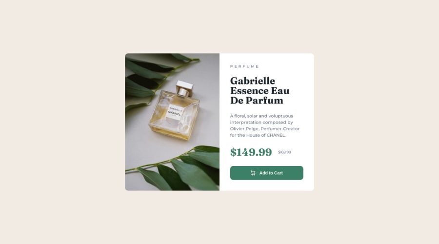
Design comparison
SolutionDesign
Community feedback
- @MelvinAguilarPosted 10 months ago
Hello there 👋. Good job on completing the challenge !
I have some suggestions about your code that might interest you.
HTML 🏷️:
- You could use the
<del>tag to indicate the price that was before the discount.
- The product image is not a decoration. You must not use the background-image property to add the product image. Instead, use the
<img>tag to add the image. Use the background-image property only for decorative images that do not add any information to the page.
- Use
min-height: 100svhinstead ofheight. Setting the height to 100svh may result in the component being cut off on smaller screens, such as a mobile phone in landscape orientation.
I hope you find it useful! 😄 Above all, the solution you submitted is great!
Happy coding!
Marked as helpful1@Jithin-b-pPosted 10 months ago@MelvinAguilar Thank you for the suggestions. It helps alot..!!👏😊
0 - You could use the
Please log in to post a comment
Log in with GitHubJoin our Discord community
Join thousands of Frontend Mentor community members taking the challenges, sharing resources, helping each other, and chatting about all things front-end!
Join our Discord
