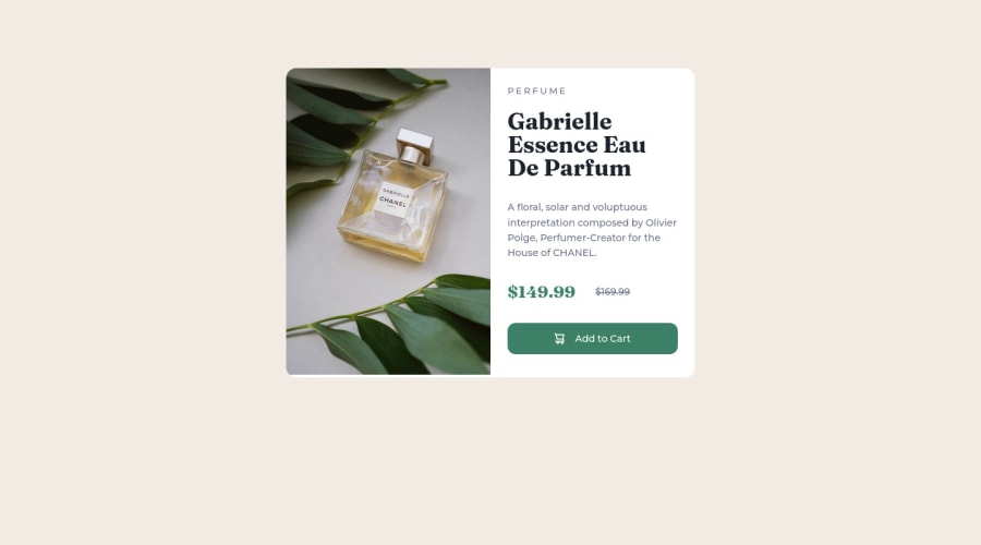
Design comparison
SolutionDesign
Solution retrospective
What do you think? Any advices to share?
Community feedback
- @VCaramesPosted about 2 years ago
Hey @Mirna-Latif, some suggestions to improve you code:
- To center you content to your page, add the following to your Body Element:
body { min-height: 100vh; display: grid; place-content: center; }-
The Alt Tag Description for the image needs to be improved upon. You want to describe what the image is; they need to be readable. Assume you’re describing the image to someone.
-
This challenges requires the use of two images 🎑 for different breakpoints. The Picture Element will facilitate this.
Here is an example of how it works: EXAMPLE
Syntax:
  <picture>
    <source media="(min-width: )" srcset="">
    <img src="" alt="">
  </picture>
More Info:
https://www.w3schools.com/html/html_images_picture.asp
https://web.dev/learn/design/picture-element/
Happy Coding! 👻🎃
Marked as helpful0
Please log in to post a comment
Log in with GitHubJoin our Discord community
Join thousands of Frontend Mentor community members taking the challenges, sharing resources, helping each other, and chatting about all things front-end!
Join our Discord
