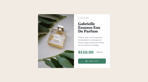
Submitted almost 3 years agoA solution to the Product preview card component challenge
product-preview-card-component
materialize-css

@mdsohailali
Solution retrospective
Hey guys this is one of the easy and best challenge to utilize your html and css skills. Thanks to frontend mentor for providing these challenges for free to people like me, On my way to do the next challenge.
Code
Loading...
Please log in to post a comment
Log in with GitHubCommunity feedback
No feedback yet. Be the first to give feedback on Md Sohail Ali's solution.
Join our Discord community
Join thousands of Frontend Mentor community members taking the challenges, sharing resources, helping each other, and chatting about all things front-end!
Join our Discord