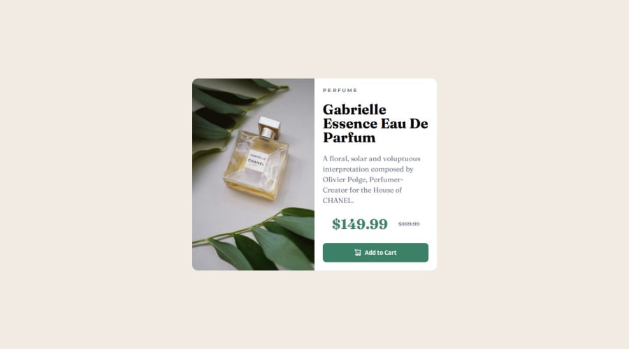
Design comparison
Solution retrospective
[+] The design looks decent and pretty similar to the desired layout. [-] Not quite responsive because I have not learned how to do it yet. [-] I would draw the layout on paper before starting to code!
What challenges did you encounter, and how did you overcome them?[-] It was quite difficult to position the image until I figured out that I could just use width of 50% for the card. [-] Minor text decoration and styles that needed just a quick google.
What specific areas of your project would you like help with?[-] Responsiveness-related advice would be a nice.
Community feedback
- @Abbassher55Posted 9 months ago
Your solution looks great however it will be more accurate to the design when you make it responsive as you mention that you will work on responsiveness. I will give you a small suggestion which will make the work easy for u. Just change the direction of card flex in mobile version as flex-direction:column; so it will make the image on top and right container in bottom and will make your work easy also you have to change border radiuses in mobile version.
Keep up the good work and happy coding
Marked as helpful1
Please log in to post a comment
Log in with GitHubJoin our Discord community
Join thousands of Frontend Mentor community members taking the challenges, sharing resources, helping each other, and chatting about all things front-end!
Join our Discord
