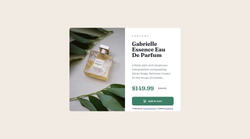
Not Found
Not Found
Not Found
Not Found
Not Found
Not Found
Not Found
Not Found
Not Found
Not Found
Not Found
Not Found
Not Found
Not Found
Not Found
Not Found
Not Found
Not Found
Not Found
Not Found

Submitted

Product-preview-card-component Solution

Siddharth 230

@siddharth-1407

Desktop design screenshot for the Product preview card component coding challenge

This is a solution for...

  • HTML
  • CSS
1newbie
View challenge

Design comparison


SolutionDesign

Solution retrospective


This was my first time testing Media Queries. All feedback are welcome. If you have any suggestion on how I can improve it, feel free to leave your comments! Thank you!

Community feedback

Lucas 👾 104,420

@correlucas

Posted

👾Hello Siddharth, Congratulations on completing this challenge!

I saw your solution preview site and I think it's already really good. Here’s some tips for you to improve it:

THE PICTURE TAG is a shortcut to deal with the multiple images in this challenge. So you can use the <picture> tag instead of importing this as an <img> or using a div with background-image. Use it to place the images and make the change between mobile and desktop, instead of using a div or img and set the change in the css with display: none with the tag picture is more practical and easy. Note that for SEO / search engine reasons isn’t a better practice import this product image with CSS since this will make it harder to the image. Manage both images inside the <picture> tag and use the html to code to set when the images should change setting the device max-width depending of the device desktop + mobile.

Check the link for the official documentation for <picture> in W3 SCHOOLS: https://www.w3schools.com/tags/tag_picture.asp

Save your time using a CSS RESET to remove all default settings that are annoying as the margins, paddings, decorations and optimize it making easier to work,see the article below where you can copy and paste this css code cheatsheet: https://piccalil.li/blog/a-modern-css-reset/

✌️ I hope this helps you and happy coding!

Marked as helpful

1

Siddharth 230

@siddharth-1407

Posted

@correlucas Thanks Lucas! I was familiar with the PICTURE TAG but i didn't know we could change the image like that depending on the device. I've no idea about good or bad practices in regards to SEO, i understand how its not a good practice. Ill practice improving to that end.

0
Elaine 11,400

@elaineleung

Posted

Hi Siddharth, great job in using media queries here for the first time! 😊 I think you did many things well here, such as centering the component with flexbox. I just got some other suggestions for you that might help you out here:

  1. To make this more responsive, try using the max-width property instead of just width (max-width: 40em instead of width) so that the component can be resized depending on the browser width.

  2. I'm viewing this on my laptop, and the top of the card in mobile view is touching the top of the browser. Try adding a bit of margin around the card to prevent that.

  3. Instead of using background images for the product images, I highly suggest that you try using the picture element or img with srcset. Using background image is not too appropriate here because it's meant to be used as a background while there are other things in the container, such as text. Also, this is a product image and thus is central to the content of the message, and so it should be in the HTML so that screen readers can read all the info. That way, you also don't have to set a height for the card, which you most definitely would do if you are using an empty div with just a background image. To use the picture element, try something like this:

    <picture>
       <source media="(max-width: 600px)" srcset="image-mobile.png" />
       <img src="image-desktop.png" alt="Glass perfume bottle placed against a leafy background" />
    </picture>
    
  4. I notice that you used a desktop first approach here; see whether you can try a mobile first approach for your next challenge and then compare the difference.

Hope some of this can help you out, and you're doing great, so keep going!

Marked as helpful

1

Siddharth 230

@siddharth-1407

Posted

@elaineleung Thanks for your informative and helpful comment. I see how using the image as a background was not appropriate, when i saw that there were 2 different images, i could only think of the background. I didn't know about srcset, i know now thanks to you. Ill keep a note of that. Ill try max-min and try the mobile first approach in my future projects now. Thanks you!

0

@D-KILLJOY

Posted

You did a really good job, It's responsive. But it's showing an error because you put a (section) element inside your (button) which isn't supposed to be so and the mobile view always try to add some (Padding) or (margin) so that it doesn't rest directly on the edge, I nested mine in a (main) element and used flex-box to center it, that's a suggestion for a fix and remove the (section) element that's nested inside the button element.

Marked as helpful

1

Siddharth 230

@siddharth-1407

Posted

@D-KILLJOY Thanks! Yea i was surprised when i saw that. i had no idea about semantics till now. I fixed it now. After your comment i tried adding (margin) and (padding) but once it reaches 375px, the (margin) or (padding) only appears on the right side. The card stays in the corners after that covering the whole screen width because the size of the card is also 375px in @media. Plus it adds a horizontal scroll bar which can only scroll right ways, as the margin or padding appears to be on the right side only after it reaches the size limit.

0

@D-KILLJOY

Posted

@siddharth-1407 You're welcome. You can reduce the size of the card to 350px and add the margin or use flex-box to style it. one more thing set the height of the body to (100vh) that way it occupies the whole screen and the card doesn't get cut at the top and bottom.

Marked as helpful

0
Siddharth 230

@siddharth-1407

Posted

@D-KILLJOY ohh yess i can do that, ill try reducing the card size and the fonts if needed. Thanks!

0

Please log in to post a comment

Log in with GitHub
Discord logo

Join our Discord community

Join thousands of Frontend Mentor community members taking the challenges, sharing resources, helping each other, and chatting about all things front-end!

Join our Discord