Design comparison
Solution retrospective
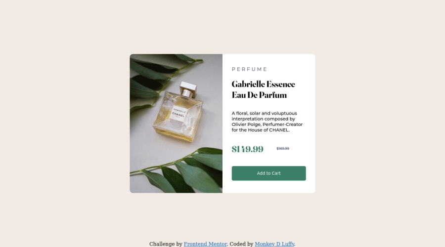
I created a product preview card, the desktop design was done fairly well, however, I had a few problems with media query and trying to position the card in the centre of the screen when the width was smaller. Can I please receive some feedback on the project, thanks a lot :)
Please log in to post a comment
Log in with GitHubCommunity feedback
- @BernardusPH
Hey ALIEU here is my goto for centering in the middle of the screen:
body{
min-height:100vh;
display:grid;
place-items:center;
}

/* Please use a main element its good practice. */
this is a good starter. You can use this with the mobile and desktop media, just play with the width and height and also the margin and you will be good
Join our Discord community
Join thousands of Frontend Mentor community members taking the challenges, sharing resources, helping each other, and chatting about all things front-end!
Join our Discord
