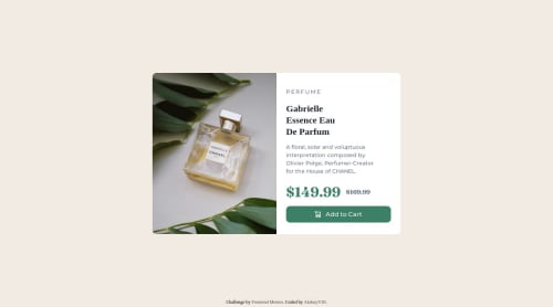
Submitted over 2 years agoA solution to the Product preview card component challenge
product-preview-card-component
@AkshayV30

Solution retrospective
What are you most proud of, and what would you do differently next time?
I am proud of creating a simple webpage component which is modular in nature can be coded to be used in any other component of a website.
What challenges did you encounter, and how did you overcome them?Faced challenges while writing the media queries and while making the edges of the card round at edges.
What specific areas of your project would you like help with?Can the code be improved further with less lines of code while maintaining readability if so please let me know?.
Code
Loading...
Please log in to post a comment
Log in with GitHubCommunity feedback
No feedback yet. Be the first to give feedback on Akshay minz's solution.
Join our Discord community
Join thousands of Frontend Mentor community members taking the challenges, sharing resources, helping each other, and chatting about all things front-end!
Join our Discord