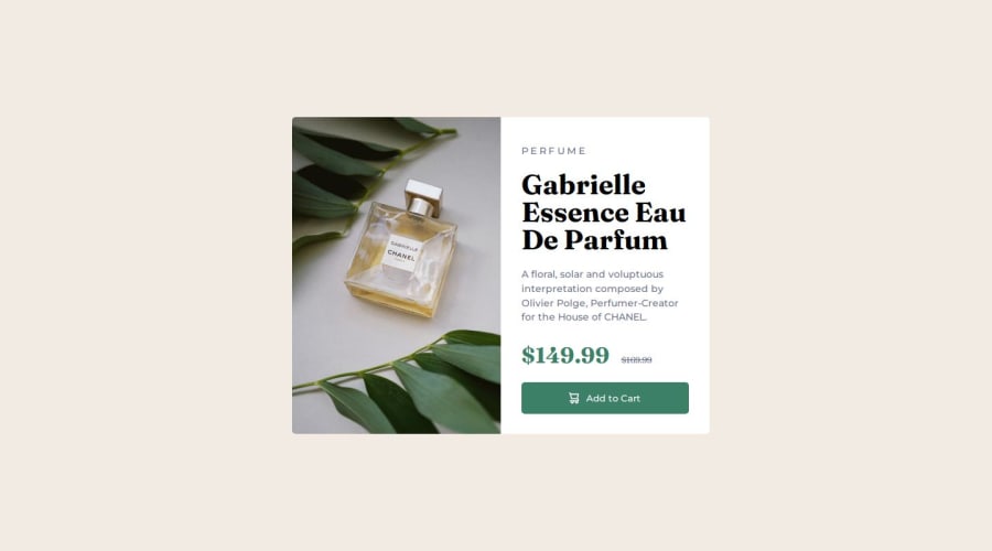


Design comparison

Community feedback
- @Islandstone89Posted 8 months ago
HTML:
-
Every webpage needs a
<main>that wraps all of the content, except for<header>andfooter>. This is vital for accessibility, as it helps screen readers identify a page's "main" section. Wrap the card in a<main>. -
Use the
<picture>element to showcase different image versions based on the user's screen size. -
Don't use hyphens or the word "image" in the alt text.
-
"PERFUME" should be changed to "Perfume". Use the CSS declaration
text-transform: uppercase;to style the text visually. And change it to a<p>. -
"Gabrielle Essence Eau De Parfum" is the main heading, so change it to a
<h1>. Remember to never skip heading levels - an<h4>should be preceded by a<h3>. -
Add visually hidden text for the prices; screen readers would find them confusing otherwise:
 <div class="price">
     <p><span class="visually-hidden">$149.99</span><span class="visually-hidden"><del>$169.99</del></span></p>
  </div>
CSS:
.visually-hidden { clip-path: inset(50%); overflow: hidden; position: absolute; white-space: nowrap; width: 1px; height: 1px; }-
The icon cart is decorative, so it should have empty alt text:
alt="". -
Remove the text that is commented out.
CSS:
-
Including a CSS Reset at the top is good practice.
-
Add around
1remofpaddingon thebody, so the card doesn't touch the edges on small screens. -
On the
body, changeheighttomin-height- this way, the content will not get cut off if it grows beneath the viewport. Remove thewidth- thebodyis a block level element, meaning it takes up the full width by default. -
Except for the button, remove all widths and heights.
-
Add a
max-widthin rem on the card, to prevent it from getting too wide on larger screens. -
font-sizemust never be in px. This is a big accessibility issue, as it prevents the font size from scaling with the user's default setting in the browser. Use rem instead. -
Images should have
display: blockandmax-width: 100%- the max-width prevents overflowing of the container. -
It's common to write the mobile styles as the default and use media queries for larger screens. Media queries must be in em or rem, not
px.
0 -

Please log in to post a comment
Log in with GitHub
Join our Discord community
Join thousands of Frontend Mentor community members taking the challenges, sharing resources, helping each other, and chatting about all things front-end!
Join our Discord