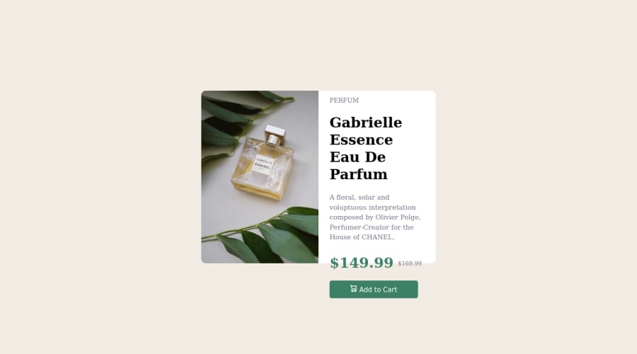
Design comparison
SolutionDesign
Solution retrospective
This challenge was pretty good and any feedback especially critics would be highly appreciated
Community feedback
- @BLADEHEDAPosted about 2 years ago
Thanks man . you got that right with the fixed units . its being messing up my responsive designs . Thanks for your feedback. Besides can you give me your whatsapp so i can pm you every time i have worries or doubts during my coding sessions.
0 - @NaleekaPosted about 2 years ago
Hi @BLADEHEDA 👋
The best practice is not to use px units. Use rem instead
Don't use fixed heights/widths. Ex:
.container{ height:390px; width:530px; }
Use min-height, min-width Ex:
.container{ min-height: 20rem; min-width: 33rem; }
That's why your Add to cart button got out of the container box
- Put whole "container" div in to a main tag
<main> <div class='container'> // your content goes here .... </div> </main>
Nice work buddy 🖤
Hope this helps.Happy Coding 😄👩🚀
0
Please log in to post a comment
Log in with GitHubJoin our Discord community
Join thousands of Frontend Mentor community members taking the challenges, sharing resources, helping each other, and chatting about all things front-end!
Join our Discord