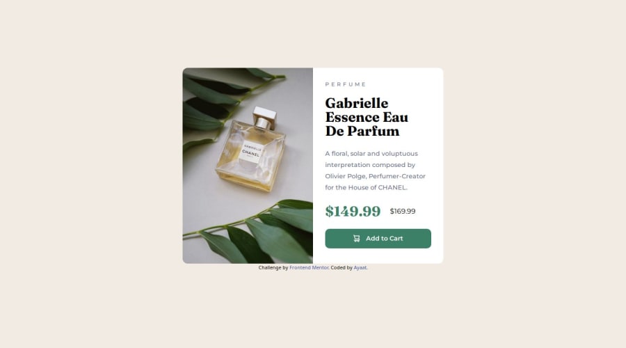
Design comparison
Solution retrospective
Getting used to the idea of creating components first which is very useful for real world projects that tent to increase in scale.
What challenges did you encounter, and how did you overcome them?I encountered challenges with getting the negative spacing right, especially around the card content. I was able to adjust the widths and padding to a degree which solved the issue however, I think it would be more reasonable to figure out how to go about it from the start of the project.
What specific areas of your project would you like help with?I would appreciate any feedback on how to style the background image to look exactly like the design as looking at the solution and design side by side, I can tell they are a few pixels off looking similar.
Please log in to post a comment
Log in with GitHubCommunity feedback
No feedback yet. Be the first to give feedback on Ayaat's solution.
Join our Discord community
Join thousands of Frontend Mentor community members taking the challenges, sharing resources, helping each other, and chatting about all things front-end!
Join our Discord
